Project 1 - How do Dams change river hydrology? (Done in R), Source Code
- Project/Tool Purpose: Discover your dam of interest and how they are changing ur river flow.
- Project/Tool {Input} and [Output]: {USGS Gage Peak Flow Data @ Rochester, NY, NOAA Rain Gage Data} –> [how cumulative rainfall is associated with river peak flow + how dam construction change river flow]
- Example Site Location: Genesee River
- Project Duration: 1926-2015
- PLEASE note: you would need some minimum R and R Studio knowledge to use this tool.
Overview
- Section 1. Getting Familiar with the site
- Section 2. Getting data input
- Section 3. Data organization
- Section 4. Building analysis functions
- Section 5. Applying the functions and graph results
- Section 6. Plotting results
- Section 7. Interpreting results
Section 1. Getting Familiar with the site
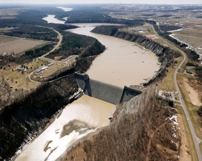
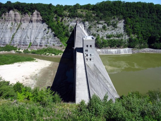
According to wiki, Mount Morris Dam was built between 1948 and 1952. Here are some great pictures of this magnificant dam:
Here is where everything is. Red label is the USGS flow gage station. Blue label is the dam location.
Back to Overview
Section 2. Getting data input
If you do not wish to go through this section, you can download data input for peak flow and precipitation directly. Then move on to Section 4.
USGS Peak Flow Data
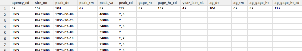
- I. Head over to the USGS site, and this page displays the annual peak flow (which is a fancy word for the highest flow in a given duration) from 1785 to 2015.
- II. Download all peak flow data by clicking on the “Tab-separated file” option or click here.
- III. Once the data is downloaded, manually delete all metadata which starts with the symbol “#”. You can do this in a text editor or in R-Studio directly. Rename your file as ‘project1_genesseall’.
- VI. Now, the peak flow data is ready for input, you can import the text file by typing below in R:
genesseallm <- read.delim("~/Downloads/project1_genesseall.txt"); ##Remember to change your file path accordingly
##here we rename out peak flow data as "genesseallm"
⧸⧸View(peakflow
-
V. Upon executing the codes above, you will see something like this (sorry it is shrunk, but hopefully you get the idea):
-
VI. The data we will need is in the columns of “peak_dt” (date) and “peak_va” (peak flow).
NOAA Precipitation Data (at Rochester Airport)
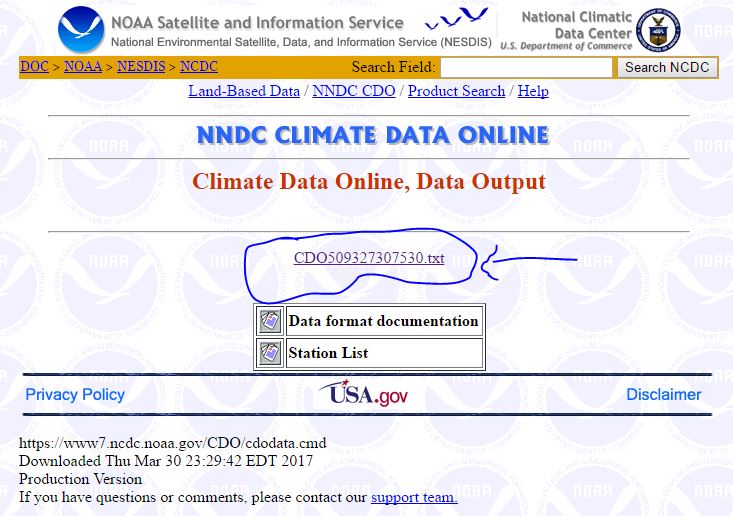
- I. Head over to the NCDC site for daily climate, and follow the instructions on this page to select all of the available data from the Rochester Airport, select the option with “Comma Delimited”.
- II. Download all weather gage data by clicking on the text file (you will see a similar screen like below (click on the image to zoom in):
- III. Once the data is downloaded, rename your file as ‘project1_climate’. You can import the text file by typing below in R:
#install package 'readr' before running the script below
library(readr)
climate <- read_csv("C:/Users/jeffj/Downloads/project1_climate.txt") ##Remember to change your file path accordingly
##here we rename out peak flow data as "climate"
View(project1_climatel)
-
V. Upon executing the codes above, you will be able to import the gage data from the airport.
-
VI. The data we will need is in the columns of “YEARMODA” (date) and “PRCP” (precipitation in inches).
Now you are ready to organize the data.
Back to Overview
Section 3. Data organization
Here we are going to organize our data before the analysis.
- I. Once you have both of your peak flow and precipitation data ready, let’s start organizing the data by cleaning them up a bit.
- II. For the climate data, there are two tasks which need to be done:
- II.I extract only “YEARMODA” (date) and “PRCP” (precipitation) columns.
- II.II remove the last “G” symbol in the PRCP column, and then replace all 99.9 values with 0 values (replace with 0 instead of null because it will be easier for later correlation analysis).
#II.I climate<-data.frame(climate$YEARMODA, climate$PRCP) #II.II climate$PRCP<-substr(climate$PRCP, 1, 4) #here we ignore the last letter for records in the PRCP column climate$PRCP([climate$PRCP==99.9])<-0 #replace all 99.9 values with 0 values - III. For the geneseeallm data, you would need to extract only the columns of “peak_dt” (date) and “peak_va” (peak flow).
#III
geneseeallm<-data.frame(geneseeallm$peak_dt, geneseeallm$peak_va)
Back to Overview
Section 4. Building analysis functions (two functions total).
####Function 1.
First, we are going to build our correlation function between cumulative rainfall and annual peak flow step-by-step.
- I. Cumulative precipitation using moving sum function.
movsum<-function(x){
filter(x,rep(1,nn),sides=1)
}
Here we used filter function, it applies a moving sum function over a time series. For example, if you have a list of data like 1,1,1,1,1,1,1,1,1, you want to apply a moving sum at a window of 3 records, and you only care about all data past the record of interest. x is the number of observations before the data you would want to sum up. You can write it below:
filter(rep(1,9),rep(1,3),side=1)
This will transform the original data from 1,1,1,1,1,1,1,1,1 to NA,NA,3,3,3,3,3,3,3. Hope you get what I mean here.
- II. Alright, after building the moving sum function, we can start applying the movesum function to the precip data.
test<-data.frame(climate[,1],as.numeric(movsum(climate[,2])))
test is the first stage “data holder” of the function, for holding the data after applying the movesum function. test data has two columns, the first column is the time of the precipitation from the original precip record. The second column is the data output from the original precip.
- III. Match the cumulatively summed data with the peak flow data and getting rid of NA values.
test2<-data.frame(genesseall,test[match(genesseall[,1],climate[,1]),2])

test2[is.na(test2)]<-0
test2 is the second data holder to combine the peak flow data and the move summed data, this combination was done through using the match function, as well as using the []. For NA values, we replaced them with 0s. Moving sum can not be carried out with NA values.
- IV. Conducting correlation test.
test3<-cor(test2, method="spearman")
test3 is the third data holder for storing results from the correlation test. We did assume that either the peak flow or cumulative rainfall is non-normal distribution. Thus, we used the spearman correlation.
- IV. Print results.
print(test3[2,3])
Since test3 hold the results of the correlations, we can then extract the value of how many days was cumulated and the correlation values.
- IV. Combine all components of function 1.
tf<-function(nn){
movsum<-function(x){
  filter(x,rep(1,nn),sides=1)
}

test<-data.frame(climate[,1],
            as.numeric(movsum(climate[,2])))


test2<-data.frame(genesseall,
                  test[match(genesseall[,1],climate[,1]),2])

test2[is.na(test2)]<-0

test3<-cor(test2,method="spearman")
#test3<-rcorr(as.matrix(test2), type="spearman")$P[2,3]

#print(test2)
print(test3[2,3])
}
You will notice that function 1 has another function inside of it to calculate the move sum. This not only saves spaces, but also combines them into one powerful correlation function.
We named function 1 with the name tf, so when we call this function later, we can just type in following to get a list of correlation numbers based on the number of days you need to cumulate the precipitation:
tf( number of days you need to accumulate precipitation ).
####Function 2.
install(Hmisc)
library(Hmisc) #load the Hmisc package
tf2<-function(nn){
  movsum<-function(x){
    filter(x,rep(1,nn),sides=1)
  }

  test<-data.frame(climate[,1],
                   as.numeric(movsum(climate[,2])))


  test2<-data.frame(genesseall,
                    test[match(genesseall[,1],climate[,1]),2])

  test2[is.na(test2)]<-0

  #test3<-cor(test2,method="spearman")
  test3<-rcorr(as.matrix(test2), type="spearman")$P[2,3]

  #print(test2)
  print(test3)
}
Function 2 is named after tf2, in a way, it is very similar to function 1, the only difference is that function 2 will print out p values instead of correlation values. P values will help us determine if the correlation values are significant or not.
Back to Overview
……Phew, still with me? Almost there.
Section 5. Applying the functions and graph results
There are many ways of applying functions in R. Here we can apply tf and tf2 using the mapply function. What mapply does is essentially generating a new table of inputs and outputs of a function of your interest.
like so:
| input | output |
|---|---|
| input1 | output1 |
| input2 | output2 |
| input3 | output3 |
| … | … |
In our example the output table for tf will look like this:
| number of days for precipitation cumulation |
correlation |
|---|---|
| 2 days | … |
| 3 days | … |
| 4 days | … |
| … | … |
In our example the output table for tf2 will look like this:
| number of days for precipitation cumulation |
p values of correlation |
|---|---|
| 2 days | … |
| 3 days | … |
| 4 days | … |
| … | … |
So, we can use the following code to cumulate the precipitation and produce the correlation from tf function and produce p values of correlation from tf2 function.
mapply(tf,2:365) #correlation values from 2 to 365 days precipitation cumulation

mapply(tf2,2:365) #p values of correlation from 2 to 365 days precipitation cumulation
Back to Overview
Section 6. Plotting results
What’s really great about R is that you can super compact everything together. I have mentioned that before you can embed one function in another function. Here, we can embed the results of the mapply in the plotting function, for example:
plot(mapply(tf2,2:365),.....)
We can write out the plotting result from both tf and tf2 fully as such, remember, we will separate the data into two sections (before the dam was build in black and after the dam was dam was built in red):
par(mfrow=c(2,1))

genesseall<-genesseallm[1:24,]

plot(mapply(tf,2:365),main='Precipitation Cumulation Period vs. Correlation Result with Peak Flow',
     ylab='Corellation Result',
     xlab='Precipitation Cumulation Period (days)')

genesseall<-genesseallm[28:90,]

points(mapply(tf,2:365),col='red')
legend('topright',c('before_dam','after_dam'),
       pch=1,
       col=c('black','red'))
#################
genesseall<-genesseallm[1:24,]
plot(mapply(tf2,2:365),main='P values',
     ylab='P values',
     xlab='Precipitation Cumulation Period (days)',
     ylim=c(0,0.1))

genesseall<-genesseallm[28:90,]

points(mapply(tf2,2:365),col='red')
#abline(h=0.1)
legend('topright',c('before_dam','after_dam'),
       pch=1,
       col=c('black','red'))
polygon(c(-100,400,400,-100),c(0.05,0.05,0,0), col=rgb(0.22, 0.22, 0.22,0.5))
#highlight the area of p values where the correlations are significant
The plot will look like this:

Back to Overview
Section 7. Interpreting results
In out first plot (top plot in the figure above). What is very very interesting here is that you can see that the correlation shifts both in the x and y axises. On the x-axis, we see the before dam section has stronger correlation around 100 days, after dam section has a stronger correlation around 200 days. On y-axis, maximum correlation is about 0.5 for before dam section, maximum correlation is about 0.2 for after dam section.
Which mean that by constructing the Mount Morris Dam, peak flow/flooding at Rochester, NY is much less associated with the cumulative rainfall. Peak flow has a stronger correlation with a much delayed cumulative rainfall, from approximately 100 days (p<0.05, from bottom plot, p<0.05 means it is statically significant) to 200 days (p<0.05, from bottom plot), and the magnitude of this association is reduced as well.
All in all, this means Mount Morris Dam has successfully delayed the rainfall-induced peak flow/flood to arrive at Rochester, NY from approximately 100 days (p<0.05) to 200 days (p<0.05). The dam gives more time for rainfall generated flow to make itself downstream and thus reduce the chance of flooding. Brilliant!
Mean and Variance Changes in Flow Alone (Bonus)
Another way of analyzing the flow at Rochester is through comparing the flows before and after the dam constructions.
Let’s start by using plotting a box plot:
before<-genesseallm[1:24,][,2] #before dam section
after<-genesseallm[28:90,][,2] #after dam section
boxplot(before,after,xaxt = "n",ylab="peakflow (cfs)")
axis(1,at=1:2,labels=c('before dam construction','after dam construction'))
Resulting plot will look like this:

What we can see is that the dam has drastically reduced the overall peak flow at Rochester, NY by almost 5000 cfs. There is actually more variability in after dam section of data in this plot, but we do need to be careful that after dam section have 63 observations, as before dam has only 24. Thus, in order to compare if the two datasets are completely different or not, we have to use ANOVA.
Anova is famously known for comparing two treatment values. We can use it here to compare if the construction of a dam (as a factor of treatment) has statistically significantly changed river peak flow at Rochester, NY.
We can use the following code to do this:
Data <- data.frame(
  Y=c(before,after),
  Site =factor(rep(c("before", "after"), times=c(length(before), length(after))))
)

fit<-aov(Y~Site,data=Data)
summary(fit)
TukeyHSD(fit) #post hoc anova
The result p value is 2.96E-7. This means the change in peak flow is statistically significant. When applying post-hoc anova, we see that the dam has statically significantly (p<0.05) reduce the peak flow at Rochester by an average of 6055.36 cfs with a 95% confidence interval of 3892.74 cfs to 8217.97 cfs.
Back to Overview
MIT License
Copyright (c) 2017 Ge (Jeff) Pu